When creating classroom materials, use fonts that are not difficult to read.
Example:
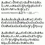
Some fonts have been identified as being easier to read or concentrate on for people with visual processing differences. Teachers can change their default software settings or employ them when making classroom materials, so as to allow greater access.
Further Reading:
British Dyslexia Association – Typefaces for Dyslexia
American Writers & Artists Inc. – The Best Fonts to Use in Print, Online, and Email
The Academic Minute – The Sylexiad Typeface
Created by Louis Olander
Reviewed by Kristen L. Hodnett
Categorised in: (1) Perception, REPRESENTATION